You’ve done everything right. You’ve built the campaigns, dialled in the targeting, paid for the clicks, and watched the traffic roll in. And then nothing. Cart abandonment. Bounces. A conversion rate that makes you want to close the laptop and take a very long walk.
I’ve had this exact conversation with founders more times than I can count. The frustrating reality of running an e-commerce brand in 2025 is that the war isn’t just won at the top of the funnel. You can have the most brilliant ad creative in the industry, and still haemorrhage revenue if the page users land on doesn’t do its job. The budget goes in. The sales don’t come out. And somewhere in between, a potential customer quietly left.
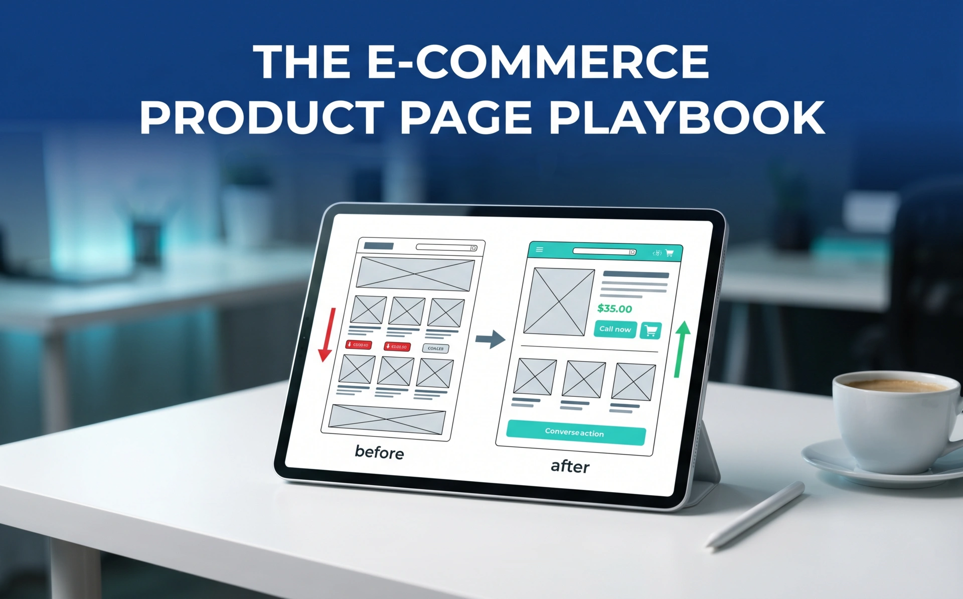
Here’s what most brands miss: the product page is not a digital flyer. It is not a glorified catalogue entry. It is, in every meaningful sense, your most important salesperson. It works 24/7, speaks to thousands of people simultaneously, and, unlike a human sales rep, it either converts or it doesn’t, with brutal consistency and zero excuses.
At Digital Natives, we’ve spent years architecting digital experiences for brands that are serious about growth. And the single most consistent lever we pull to move the needle on revenue? E-commerce product page optimization. Not a rebrand. Not a new ad strategy. The product page, rebuilt from the ground up with intent.
This guide is for the founders, CTOs, and Product Managers who are done leaving money on the table. Let’s get into it.
What Are Ecommerce Product Pages?
On the surface, the answer seems obvious: a page with a photo, a price, and a button. But that definition is so reductive it borders on dangerous, because it leads teams to treat the product page as a static asset rather than a living, working conversion engine.
A modern e-commerce product page is the intersection of three distinct disciplines: psychology, UX design, and technical performance. Each one is non-negotiable. Let a single pillar collapse, and the whole structure underperforms.
From a psychology standpoint, the page has to manage a user’s emotional journey, creating desire, resolving doubt, and providing enough social proof to bridge the gap between “I’m interested” and “I’m buying.” From a UX standpoint, it has to present information in a hierarchy that respects how humans actually read and scan (hint: we don’t read linearly online — we hunt). And from a technical standpoint, it has to load quickly, render correctly across all devices, and be structured in a way that search engines can parse and trust.
Think about it this way: every element on a product page is either earning its place or costing you a conversion. A blurry image? That’s a trust killer. A vague product description? That’s an objection left unanswered. A three-second load time on mobile? That’s the customer leaving before the page has even finished saying hello.
Product detail page optimization begins with accepting that a product page is a piece of persuasive architecture and it needs to be designed, written, and built as such.
On-Page Optimisation Tips & E-E-A-T

Let’s look at the numbers first, because they have a way of cutting through opinion.
According to the Baymard Institute, only 49% of top US and European e-commerce sites achieve a “decent” or “good” product page UX performance. That means more than half of online stores, including many well-funded, recognisable brands, are actively undermining their own conversion rates through poor product page execution. This isn’t a small-business problem. It’s an industry-wide one.
So what does good actually look like?
Visual Hierarchy & Clarity
The human eye moves fast, and it moves predictably. In our experience building digital ecosystems at Digital Natives, the brands that convert best are the ones that have engineered their product pages to guide attention rather than scatter it. The hero image earns the first look. The product name and key value proposition anchor that look. The price and CTA close the deal before the user even needs to scroll.
Cluttered pages where every element competes at the same visual weight force the brain to work too hard. And a tired brain defaults to inaction. Strip the noise. Use whitespace as a design tool, not wasted space. Every pixel should either be building desire or dismantling doubt.
Mobile-Responsive Design
This one should be obvious by 2025, but I’ve seen far too many brands treat mobile as an afterthought; a scaled-down version of the desktop experience, rather than a purpose-built one. Mobile users behave differently. They scroll faster, they’re more easily distracted, and their tolerance for friction is virtually zero.
Google’s data is unambiguous on this: 53% of mobile users will abandon a page that takes longer than three seconds to load. Three seconds. That’s not a performance benchmark; that’s a hard revenue threshold.
Core Web Vitals & Technical Performance
This is where I want to get specific, because “fast website” is advice so vague as to be useless.
Google’s Core Web Vitals: Largest Contentful Paint (LCP), Cumulative Layout Shift (CLS), and Interaction to Next Paint (INP) are the actual metrics that determine whether your site is fast enough to rank and fast enough to convert. LCP measures how quickly your main content loads. CLS measures whether your page layout jumps around as it renders (which is infuriating and kills trust). INP measures how quickly the page responds to user interaction.
At Digital Natives, we build on modern JavaScript frameworks; React, in particular, because it enables the kind of component-based architecture that makes achieving strong Core Web Vitals scores tractable. React’s virtual DOM and server-side rendering capabilities mean we can deliver pages that feel near-instant, even on mid-range mobile devices. But the framework is only as good as its implementation. Lazy loading images, code splitting, and eliminating render-blocking resources are all part of the standard checklist we run on every build.
Structured Data & Schema Markup
Here’s something that too many e-commerce teams overlook in favour of surface-level optimisation: Schema markup. Implementing structured data, specifically Product, Review, and Offer schemas, tells search engines exactly what your page contains. This feeds directly into Google’s E-E-A-T (Experience, Expertise, Authoritativeness, Trustworthiness) evaluation framework.
When Google can parse your page’s product name, price, availability, and review rating in structured code, it trusts your content more. That trust translates into better rankings, rich snippet eligibility (star ratings in the SERP, anyone?), and ultimately, more qualified traffic arriving at your page in the first place. E-commerce product page optimization that ignores structured data is leaving an entire dimension of performance on the table.
Social Proof: The Conversion Multiplier

The evidence on reviews is staggering and should be treated as a mandate, not a suggestion. Research highlights that displaying customer reviews can increase conversion rates by up to 270%, with the effect compounding significantly for higher-ticket products. The psychology is straightforward: humans are tribal decision-makers. We look to others like us to validate our choices. A product page without reviews isn’t just missing a feature; it’s missing its most powerful trust signal.
And the format matters as much as the presence. Star ratings alone are weak. Verified purchase badges, photo reviews, and attribute-specific ratings (fit, quality, durability) are what move the needle on product detail page optimization in competitive categories.
Real-World Business Use Cases
Theory is useful. But let me show you what this looks like in practice.
Case 1: The DTC Fashion Brand with a Returns Problem
A direct-to-consumer womenswear brand came to us with a surprisingly common problem: their conversion rate was decent, but their return rate was eating into the margin. Nearly 34% of orders were coming back, with “wrong size” and “not what I expected” as the dominant reasons.
When we audited their product pages, the issues were immediately visible. Their size guides were buried in a generic FAQ, disconnected from the product context. Their imagery was beautiful but entirely static; no movement, no body diversity, no sense of how the garment actually wore on a real human being. The descriptions were marketing copy, not decision-making tools.
Applying e-commerce product description best practices, we rebuilt the product page experience from the ground up. We embedded size guides directly beneath the variant selectors, with dynamic fit recommendations based on measurements. We introduced short-form video, 15-to-30-second clips of each piece in motion, on two different body types. We rewrote the descriptions to answer the questions a thoughtful friend would ask: “Is this stiff or flowy? Does it run small? Will it crease if I wear it to a lunch meeting?”
The result? Return rates dropped by 22% within the first quarter. The product page had stopped being a sales tool and started being a decision-support tool. That’s the distinction that matters.
Case 2: The B2B Hardware Seller Losing Customers to Choice Paralysis
A B2B technical hardware distributor selling industrial networking equipment had a different kind of problem. Their product catalogue was extensive, their specs were accurate, and their pricing was competitive. But their sales team kept fielding calls from procurement managers who were confused, overwhelmed, and unable to make a final selection without hand-holding.
The product pages were technically comprehensive but cognitively brutal. Dense specification tables. Twelve configuration variants with no clear differentiation logic. A wall of acronyms and model numbers that communicated expertise to engineers but alienated procurement leads who needed simplicity.
We approached this as a product listing page best practices challenge, restructuring the information architecture to separate “decision-relevant” information from “reference” information. Key specs (compatibility, throughput, power requirements) were surfaced at the top in a scannable format. Advanced technical tables were collapsed behind an “expand” toggle for engineers who needed them. A simple comparison tool was added to help procurement managers evaluate two or three options side-by-side. And crucially, we added plain-language summaries at the top of each page: “Ideal for mid-sized enterprises running hybrid cloud environments.”
Direct sales enquiries from product pages increased by 41% in the first two months. Not because we added anything particularly revolutionary, but because we stopped making customers work to understand what they were buying.
The Philosophy Behind High-Converting Product Pages

Everything I’ve laid out here: the visual hierarchy, the technical performance, the structured data, the social proof, the use-case-specific copy, is ultimately in service of one goal: reducing the cognitive and emotional distance between a user’s intent and the act of purchasing.
People don’t bounce from product pages because they don’t want to buy. They bounce because something on the page gave them a reason not to. A missing size guide. A slow load. A vague description that raised more questions than it answered. An absence of reviews made the product feel like a gamble. E-commerce product page optimization is, at its core, the systematic elimination of those reasons.
This is not a one-time project. The best product pages we’ve built at Digital Natives are the ones our clients treat as ongoing experiments; testing image formats, headline variants, CTA placements, and review display logic on a rolling basis. The benchmark isn’t “good enough.” The benchmark is “better than last month.”
Let’s Build Something That Actually Converts
If you’ve read this far, you already know your product pages are either working hard for you or costing you silently. The gap between a page that looks fine and a page that performs at the highest level is almost never visible on the surface; it lives in the technical architecture, the UX decisions, and the copy strategy operating underneath.
At Digital Natives, we audit, redesign, and rebuild product page experiences for brands that are serious about growth. We bring together design, development, and content strategy because in our experience, it’s the integration of all three that creates the step-change in performance, not any single fix in isolation.
Ready to find out what your product pages are actually costing you?
Reach out to us, and let’s take a proper look at your current digital experience. No generic audits. No templated recommendations. Just a clear-eyed assessment of where your conversion funnel is leaking, and a practical roadmap to fix it.
Digital Natives is a forward-thinking digital agency specialising in UI/UX design, modern web development, and crafting unique digital experiences. Visit us at digitalnatives.cc.